

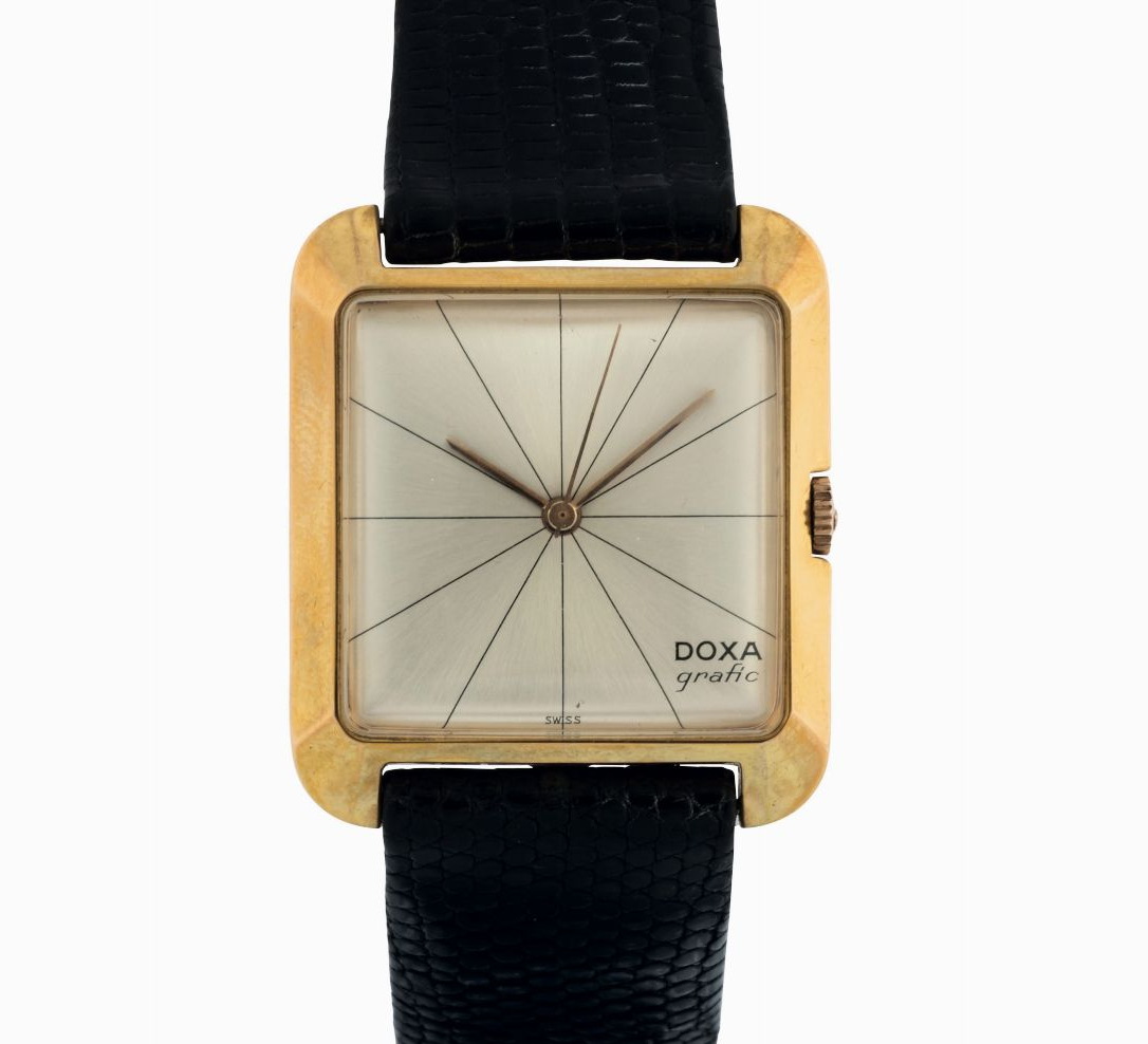
Grafic
Model History
The Grafic debuted at the end of 1957, in an era when nearly all cases were round and dials tended toward classic decorative styling. It was strongly championed by Pierre Henry, then Doxa's advertising manager, who pushed for a square case with a soft, non-angular profile, in line with the geometric essentialism of the Bauhaus: a choice that openly broke with the conventions of watchmaking at the time.
The dial, too, went through a process of experimentation before finding its identity: the first attempts leaned on dot indices and Arabic numerals, then on a cross-shaped composition, until the team arrived at the design that would become the model's signature, six thin lines crossing at the center of the dial. The Doxa logo was placed in the bottom right corner, "like a painter's signature" — an unusual detail for the time, which accentuated the graphic, almost abstract character of the dial that gave the model its name.
Having become a commercial success and a distinctive trait of Doxa's aesthetic language in the 1950s and 1960s, the Grafic was progressively overshadowed by the SUB's success starting in the late 1960s. The brand relaunched it once in 1995 and then, more thoroughly, in 2007 for the fiftieth anniversary: the modern version keeps the square case and the radial-line motif, offering steel or gold-plated cases, dials in several colors and, for the first time, a chronograph version too.
Technical Specifications
Main Executions
The Grafic was born ten years before the SUB and represents almost its stylistic opposite: where the SUB is a diving instrument designed for maximum legibility underwater, the Grafic is a city watch with an almost abstract design, with a logo placed "like a painter's signature" — a detail that, even today, remains one of the most unusual Doxa has ever put on a dial.